

This past Monday through Thursday I spent time getting my classroom set up for the new year. I love the practice of just setting things up, thinking of the adventure I'm embarking on this year, reflecting on how things were before, and just noticing that I've changed in the past few years. I am very much a perfectionist, and for the first time, I'm not trying to make everything perfect. I am also using things that other teachers have posted, instead of making my own version of it. I always found fault with what someone else posted (I am seriously talking about the font, mostly), but now I'm being less picky. I think I'm finally learning to let go of the minute details that few people, besides me, will ever notice.
One reflection I meditated on was whether or not it even mattered how my classroom was decorated. The set up most definitely matters, it creates flow, organization, and sets your routines. In fact, your classroom set-up can make or break your routines. Decorating, however, seems like something I could easily skip. Most teachers in my school don't really bother to decorate. Then I remembered all the times in the past two years that students came into my room and told me how much they missed just being my room. They said that they love how bright and colorful everything is, and that their other teachers' classrooms are dreary by comparison and it brings them down mentally. So, yes, decorating does matter on some level. It's not a priority, but it does make a difference.
My classroom is 85% done. I have some engineering prints I had made at Staples that I need to laminate before I can hang. I also have some labels to create and put on things, but other than that, I'm pretty much done. (Now I just have to do everything else.) I will do a full classroom tour, but for now I'll just post some teaser photos.
First, I fell in love with some of Sarah & Shaun Carter's ideas for different posters.

You know how some teachers have a theme for how they decorate their classrooms? One woman I subscribed to on YouTube has been setting up her room with a Harry Potter theme. It's usually elementary teachers that have themes, but I think I'm falling into a neon rainbow theme. (Neon cardstock makes for the best posters.)
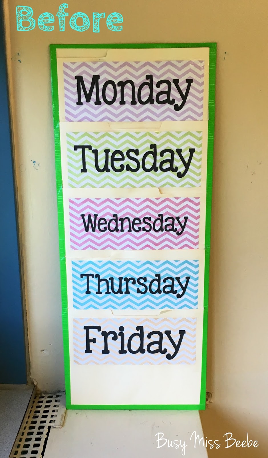
I made an organizer that holds extra homework copies sorted by day. I remade it for this year because my last one didn't match anymore, and it was starting to look a little faded and blah.

I tried using hand signals with my students for the past few years (see left poster). The only one that was every actually used/needed was the bathroom signal. I found the poster on Pinterest and just used it as it was. For this year, I finally made my own. I went with 1, 3, and 5 fingers. The bathroom signal is the same, I added an "I need something" signal, and I put the whole hand "I have something to say signal." Every year I decide that I'm going to start having students raise their hands in class, and then every year I fall back into the comfort of allowing students to call out, which is bad. I'm hoping that by putting the practice on a poster it will help remind me what my goal is, as well as reminding students what I expect. (I plan to ask my students to call me out on not enforcing the hand raising rule.)


The last big change I'm sharing today is my homework board. The pictures don't do it justice. I had to change this up because I wanted the signs to be more coordinated. Before I had three different patterns, and it just looked crazy. I also had a lot of chevron, and I'm just so over chevron. (I am now obsessed with honeycomb patterns because regular hexagons are the perfect shape.) My new signs are all the same pattern (honeycomb), and color coordinated with the color I've designated for each course. It may be hard to see, but I added a plastic sheet protector next to each "Common Core Standard" card so I can just slide the standard of the day in the sheet. (It makes life so much easier.) I also added headings for each board section using punch-out letters I purchased a few years ago, and never used. Unfortunately, I did not have enough letters for what I wanted to write, but I improvised. (I wouldn't have had enough space anyway.)


Poster Putty Tip: If you are using the blue (or sometimes white) poster putty that only sometimes seems to work, I have a trick. Place the poster slightly high/low/left/right of where you want the poster, and then slide it into position. It will flatten out the putty ball that is on the back of the poster, and increase the surface area between poster and putty and wall, creating a more secure bond. This was method was discovered from years of perfectionism. Just make sure your putty ball is not too close to the edge of the poster, or the putty will be visible.


No comments:
Post a Comment